Learning Log:
My personal relationship with art goes back a long way. When I was a teenager, I worked on a market to pay for drawing lessons. I went to an art school for two years. Later, I studied studio pottery and worked, self-employed until I became a mother. I went to adult education classes in painting regularly. There, my tutor, David McAllister, an illustrator, encouraged me to take it further, and I joined the OCA.
It took me a long time to complete the course, first I used to find it practically impossible to work when my children were at home or during school holidays. Also, my first tutor disappeared and I had to wait for the OCA to allocate another one, which was lengthy and discouraging, I stopped working until I was given a second tutor. Unfortunately she resigned. Christian Lloyd has been my tutor for the rest of the course, and I met him during a Gallery/Museum visit. At the end of the course I was delayed by a variety of small events, but the OCA gave me a bit more time and I finished my last assignment in a rush.
I was challenged because I had studied by distance learning with the Open University, and initially expected the same level of student support (which I now call "babysitting"!). I found it difficult to be more pro-active as I had to be, until I found new ways to organise myself.
Noticing that I missed discussions and quick feedback, I discussed ideas and work in progress with friends, painting tutor, and on forums. I was not discouraged anymore, and could very well work without a need for validation.
Finding 'exhibition buddies' means I go regularly too.
I was very happy with the coursework. Christian Lloyd said "you seem to work best when there are elements of caricature, humour, or strong visual dynamics at play". That's true, but I did attempt illustrations in so many different areas, that it challenged me and stretched me too.
My tutor also said that I had "strong visual work, less developed sense of visual solving".
"Visual Problem-Solving…what is it?It can be creating a video or a diagram that explains
how to do something or training you to learn how to turn SEEING into
SHOWING.", Dean Meyers.
I'm still working on improving on this, but after all the assignments, I now know I am more interested in making images that may tell a story, but not so much giving instructions, making leaflets, packaging designs, and find no interest in graphic design.
In conclusion, on completing this course I have explored and learnt new techniques, but more importantly, on a personal level I now feel stronger and better equipped to move forward on my art journey.
Thursday, 13 February 2014
Wednesday, 12 February 2014
Selected Work
Selected Work:
3) Making a mock-up:
For this project, I used an technique that I had tried once before, and made my image by putting all the elements together with a computer software. This was a huge step for me in my learning, especially as I have not used computer softwares much before. It was technical progress and also psychologically, it gave me a great boost of confidence for not being scared of attempting new things.

My tutor noted that the crude folk art approach was very appropriate to the nature of the story, as well as praising me for the progress I mentioned above.
(sketchbook pictures and notes about this is available towards the bottom of blog page below:
http://mpgovernale.blogspot.co.uk/search?updated-max=2013-02-27T07:02:00-08:00&max-results=21&reverse-paginate=true
4) Identifying tools and materials:
I had first made an illustration about "hamster school" for my daughter's school planner, which reflected the picture of her school. This was made in pencils. I decided to make a new illustration on the same theme, using acrylics and the dry-brush technique taught by Will Terry, the illustrator of "Armadilly Chili".

My tutor said the characters were well defined, and gave me advice for improving the typography. I thought that it was colorful and in a style that worked better than my last illustration, thanks to the different materials. I am still exploring ways of using acrylics, as I found I like the versatility of
this kind of material. The two versions are on my blog:
http://mpgovernale.blogspot.co.uk/search?updated-max=2013-02-27T07:02:00-08:00&max-results=21&reverse-paginate=true
4) A tattoo:

I don't like tattoos, but for the course I made myself do one. I designed an 'ironic mum tattoo', which I enjoyed. In fact I enjoyed it so much that I made an ironic Mother's Day card as well, a pop-up prototype which works. My tutor found that with a "renaissance" in the 1940's style of tattooing, the joke was reinforced by the pearl necklace. And for the card that the mechanics of the fold add another angular dimension to Mum.

5) Animals from around the world:
With my developing skills with acrylics and "new level of editing and finishing" as my tutor puts it,
I made my favourite work on this course...

I was trying to avoid the typical approach taken by other illustrators, "got away with it successfully" and the focus is on the animals. I selected bright colours that should be attractive to small children.
After seeing a copy, a professtional illustrator I know suggested that I put together a portfolio of animal illustrations to show his agent, as he thinks my slightly naive style may be fashionable.
6) Character development:
I worked on a character, from a cutting I had found in the national trust magazine. I entitled it "the unlikely gardener" because of what the lady wears. My tutor made a comment "what made her was her expression", and suggested I should see if subtle shifts in expression are important to me in respect of character development.

7) Packaging:
This is about organic buiscuits packaging for children. The colours are very bright and different for each flavour.


I had researched packaging I liked first too, and was very happy with the results. Sadly, my printer/scanner had to be used as my computer gave up accepting memory cards. The scanner changed the colours slightly and makes them look mottled and brown. They are painted in gouache on paper, because I have made up my mind by now that I like it that way, rather than using a computer to make the image. My tutor commented on what he saw and didn't like the fact that the background was not flat and not painterly. This showed me that perhaps illustrators are now like graphic artists more and more dependent on computers and expected to be able to do things I can't do.
8) Working for children:
I knew I wanted to make this image, worked out how exactly I wanted it, and made it to the best of my ability. I made lots of sketches and researched on the internet, and in the zoo.

Some of the preparatory Drawings and note:

1) Viewpoint:
In this exercise, I had made sketches from different viewpoints of something that was "Christmassy", a pile of Christmas toys. I also used my camera to take views from angles I was experimenting with. This was new to me, and I particularly liked the dynamics it created. I have found the process useful, and have used this idea again and again at the experimenting stage and for finalising designs.

For more about this exercise, here is the link to my blog page:
1http://mpgovernale.blogspot.co.uk/search?updated-min=2011-01-01T00:00:00-08:00&updated-max=2012-01-01T00:00:00-08:00&max-results=21
2) Giving instructions: making a cup of tea

After attempting a very lengthy and not very successful illustration strip, I tried again and stripped down my ideas. I was happy with it and my tutor also, making a comment about how simple and straightforward it was, "drawn with feeling". I tried to remember that "less is more" can be very useful!
(for more about this exercise, the blog page is the same as above, below 'viewpoint')
In this exercise, I had made sketches from different viewpoints of something that was "Christmassy", a pile of Christmas toys. I also used my camera to take views from angles I was experimenting with. This was new to me, and I particularly liked the dynamics it created. I have found the process useful, and have used this idea again and again at the experimenting stage and for finalising designs.
For more about this exercise, here is the link to my blog page:
1http://mpgovernale.blogspot.co.uk/search?updated-min=2011-01-01T00:00:00-08:00&updated-max=2012-01-01T00:00:00-08:00&max-results=21
2) Giving instructions: making a cup of tea

After attempting a very lengthy and not very successful illustration strip, I tried again and stripped down my ideas. I was happy with it and my tutor also, making a comment about how simple and straightforward it was, "drawn with feeling". I tried to remember that "less is more" can be very useful!
(for more about this exercise, the blog page is the same as above, below 'viewpoint')
3) Making a mock-up:
For this project, I used an technique that I had tried once before, and made my image by putting all the elements together with a computer software. This was a huge step for me in my learning, especially as I have not used computer softwares much before. It was technical progress and also psychologically, it gave me a great boost of confidence for not being scared of attempting new things.
My tutor noted that the crude folk art approach was very appropriate to the nature of the story, as well as praising me for the progress I mentioned above.
(sketchbook pictures and notes about this is available towards the bottom of blog page below:
http://mpgovernale.blogspot.co.uk/search?updated-max=2013-02-27T07:02:00-08:00&max-results=21&reverse-paginate=true
4) Identifying tools and materials:
I had first made an illustration about "hamster school" for my daughter's school planner, which reflected the picture of her school. This was made in pencils. I decided to make a new illustration on the same theme, using acrylics and the dry-brush technique taught by Will Terry, the illustrator of "Armadilly Chili".
My tutor said the characters were well defined, and gave me advice for improving the typography. I thought that it was colorful and in a style that worked better than my last illustration, thanks to the different materials. I am still exploring ways of using acrylics, as I found I like the versatility of
this kind of material. The two versions are on my blog:
http://mpgovernale.blogspot.co.uk/search?updated-max=2013-02-27T07:02:00-08:00&max-results=21&reverse-paginate=true
4) A tattoo:
I don't like tattoos, but for the course I made myself do one. I designed an 'ironic mum tattoo', which I enjoyed. In fact I enjoyed it so much that I made an ironic Mother's Day card as well, a pop-up prototype which works. My tutor found that with a "renaissance" in the 1940's style of tattooing, the joke was reinforced by the pearl necklace. And for the card that the mechanics of the fold add another angular dimension to Mum.
5) Animals from around the world:
With my developing skills with acrylics and "new level of editing and finishing" as my tutor puts it,
I made my favourite work on this course...
I was trying to avoid the typical approach taken by other illustrators, "got away with it successfully" and the focus is on the animals. I selected bright colours that should be attractive to small children.
After seeing a copy, a professtional illustrator I know suggested that I put together a portfolio of animal illustrations to show his agent, as he thinks my slightly naive style may be fashionable.
6) Character development:
I worked on a character, from a cutting I had found in the national trust magazine. I entitled it "the unlikely gardener" because of what the lady wears. My tutor made a comment "what made her was her expression", and suggested I should see if subtle shifts in expression are important to me in respect of character development.
7) Packaging:
This is about organic buiscuits packaging for children. The colours are very bright and different for each flavour.
I had researched packaging I liked first too, and was very happy with the results. Sadly, my printer/scanner had to be used as my computer gave up accepting memory cards. The scanner changed the colours slightly and makes them look mottled and brown. They are painted in gouache on paper, because I have made up my mind by now that I like it that way, rather than using a computer to make the image. My tutor commented on what he saw and didn't like the fact that the background was not flat and not painterly. This showed me that perhaps illustrators are now like graphic artists more and more dependent on computers and expected to be able to do things I can't do.
8) Working for children:
I knew I wanted to make this image, worked out how exactly I wanted it, and made it to the best of my ability. I made lots of sketches and researched on the internet, and in the zoo.
Some of the preparatory Drawings and note:
 | ||
| This is in my 6th A5 Sketchbook, I recently was inspired by the blog of the Illustrator: Kristi Anne Wakelin and started working on a A3 sketchbook, I feel grown up now! |
 | |
| a page from my A3 sketchbook |
About this image, I have mixed feelings. It is almost exactly how I had planned it. I was happy with it until my tutor said "Is that Inspector Clouseau in the audience? The portrait is interesting because it's about the nature of storytelling, it's probably for an adult audience but it's a very interesting piece of work." While I had planned it for small children, choosing a large format, bright colours, lots of things to look at everywhere... and at the same time I put Clouseau there as Disney puts jokes and references in their films for the adults who accompany children. (And also as I am French, it's a joke I can get away with.) I haven't done the market research to evaluate how successful this image would really be with children and parents.
9) Working for children:
I had studied the grammar used in different versions of "The Little Red Riding Hood" at university. It has so much meaning for me, that I decided to make a self-portrait as the little red riding hood and that image would be suitable for using for an illustration for a book for older children/teenagers.
My tutor said: "given your little red riding portrait, which was a rich piece of metaphor and personalized mythology, you might want to look at the visual work of British comedian Harry Hill who mythologies TV celebrities in his self-taught paintings." I looked at them, and they are quite mysterious to me! Putting this image here is like a note to myself: yes I have progressed a lot, but I must not forget my audience and how they read an image from their point of view, their experience. After all someone I know looked at this picture and said "I like the fox"!
Tuesday, 11 February 2014
Sketch books
Sketchbooks
Here are sample pages from my sketchbook:
My tutor advised me to pay attention to the letters that are part of an image, so I did some work about this

Here
I noticed that the woman's face was covering a bit of the text, I have
used this in my illustrations for packaging (Dino biscuits)
 |
At Easter, I
spent some time in the Heard Museum in Prescott, USA. I used to be a
potter and studied pottery in many museums, but this is the best
collection of American Native Art that I have ever seen. I mostly took photos, but for some details the sketchbook is the best.
|
 | ||
| A sample of women's heads sketched for 'the unlikely gardener'. To get a face from different angles, I chose a character from TV that looked like her, recorded it and stopped the film. |
 |
| Trying to keep sketching often - these were done on a plane |
 | |
| Working on an idea for a frog who looks a bit like a man (working for children) |
 |
| Practicing with different pens |
My tutor advised me to pay attention to the letters that are part of an image, so I did some work about this

 |
 |
| I picked up some interesting books' covers from the library, studied the letters with the images, and traced some.
This
is an example of larger size sketches/drawings that I made earlier in
the course. I wanted to use charcoal for atmosphere and showing light
and shade, so I tried working on brown paper on the floor.

Here are examples of what a page in my sketchbook looks like these days:

This
page is full of drawings, a tracing stuck on (swing), some text
printed, photocopied, cut and stuck. All of these relate to the 'seven
days' project that I had been working on. It also shows ways that I've
found to go round my problems with technology (computer software like
paint and pixlr that I haven't mastered enough, printer, camera, phone
camera, etc. at war with each other like The Housewives of Orange
County, ...)

This
page if full of tiny examples of frogs on bikes found on the internet. I
print them, cut them and glue them. It seems very long-winded, but it
works for me, and I'm happy doing it!
I
have the same sort of thing in another book for images I like, and that
I can go back to, but have nothing to do with current projects or
ideas.

Here
apart from a sketch of a frog (I was interested by its face), I found
two images in the ZSL magazine that I found interesting. Drawing and
painting them is a way to understand better what I was interested in, in
particular. I wanted to see how people had stylised a tiger on two
objects. The paper finger puppet has less details (number of small
details) and a smiley face - for children. The other one was painted on a
maracas, with other things painted around it. It's probably a jaguar,
more fierce with teeth and claws. Maybe a venerated ritual kind of image
that has found its way on an object for tourists. Here it is
decorative. So two objects with same colours, stylised, with different
audiences.
Someone
who saw me painting in the orange from my watercolour box was amazed at
how small I like to paint these (A5 Sketchbook). It's mainly for
quickness really.
|
Tutor Reports
TUTOR REPORTS
Asssignment 1:
Open College of the Arts Tutor report Student name Marie-Pierre Governale Student number 506230 Course/Module Illustration Assignment number One
The first part of the module is all about getting started by looking at contemporary and historic illustrators and understanding the importance of identifying what to communicate through the ‘getting the gist’ exercise.
Overall Comments
The first exercise asked you to research Edward Bawden / Kathleen Hale / Eric Ravilious / Edward Ardizzone / John Minton / E H Shephard / find a contemporary illustrator whose work you like and to identify and explore the differences between them. It was good to see that you looked at each of the illustrators before deciding to compare the work of Kathleen Hale and Quentin Blake. Succinct and thoughtful analysis across the both and I thought making comparisons between their family commitments was interesting, and it highlight some of the issues that face many illustrators – how they juggle the time they have to be creative and their practice. Your Teenage Rock Hero referenced Orlando very well and while the piece doesn’t overtly feel like Kathleen Hale’s style I do think it you’ve referenced some of her approaches to line and colour. Your Quentin Blake drawings feel more obviously his. Perhaps this is down to the attention you have given the materials and tools he works with. I thought the drawings worked well and I like the fact that you extended the exercise into using his approach to illustration to draw from life. You managed to capture a real sense of movement, energy, and humour in your drawings, especially with the seagulls piece. Extending this project into looking at Axel Scheffler was good and I thought your drawing of the hamsters had a great sense of character about it. The school structure was perhaps a little too busy and drew focus away from the inhabitants, maybe simplifying the background would have shifted the emphasis?
The second ‘getting the gist’ exercise asked you to condense some chosen text into keywords and then have a go at illustrating them. It’s great to see the amount of referencing you’re doing here in terms of seeing how other illustrators have dealt with similar ideas. Some of the frustrations you’ve encountered are really about getting all the tools you need in place, don’t forget Quentin Blake has had a lifetime to hone how he works. The illustration itself works reasonably well – you’ve certainly managed to sum up the ideas of the article into a stand alone image – my only reservation is in the artwork itself and this based purely on seeing your subsequent polar bear drawings that I thought had a bit more character about them. Nevertheless a very good start.
Feedback on assignment
Your first assignment asked you to create a greetings card that introduced yourself and your work. I really liked your final greetings card which had a playful cheekiness about it – partly down to the self portrait that was very self effacing, the hidden references to your interest in cartoons and having some impish looking witches with their familiar. The approach to the drawing was very good and I liked the almost textural tactic of creating tones through coloured dashed and cross-hatching. The earlier drawings maintain this energy but feel much quicker in their execution. Using your frustrations as a driving force certainly seems to work. I thought the black and white pre-drawing of your final piece was great and in many ways this could have been the final piece – perhaps just taking this very direct form of drawing and adding colour to it afterwards. If you enjoyed this way of working you might want to try drawing directly with colour via either felt tip pens or coloured pencils.
Your painting worked well, and it was good to see how you work in a more observational way, and your humour still comes through. I would be interested to know how this approach to creating images (loosely drawing with paint) relates to your drawings – do you have a preferred way of working, do you see these approaches as fundamentally different or is it a similar approach to you, but simply different materials?
Learning Logs/Critical essays
Keeping sketchbooks and a learning log is an integral part of this and every other OCA course, not only because they constitute 20% of your marks if you choose to have your work formally assessed but they are also an excellent way to see how you are developing.
Sketchbooks and learning logs perform different functions; Sketchbooks can play a variety of different roles: they can be visual diaries, reference points, used for drawing the world around you, or be used for imaginative drawing and doodles, or all of the above. For illustrators the sketchbook is a vital tool in capturing and developing your creative ideas and should be used as much as you can. Your learning log is the tool you use to help you reflect on your learning and help your tutor see how you have learned.
If you prefer to amalgamate sketchbook and learning reflections into one notebook that’s fine, as long as you do both elements of work required. You might also want to consider developing either as a web-based blog, a summative document or any combination that suits your working process the best. If youʼre new to OCA courses, read your Keeping sketchbooks and learning logs study guide for further information.
You’ve clearly thought about the benefits of moving your learning log from paper to the web. Your approach to reflection is honest and to the point, you’re using it to summarise your thinking and list key areas to develop, all of which is great.
Getting to grips with all the technology can feel like a bit of an uphill struggle at the beginning, but try not to let this get in the way too much. It’ll all come together as you progress through the module.
Suggested reading/viewing
You might want to have a look at the archive of my blog http://christianlloyd.tumblr.com/archive where you’ll find lots of naïve, playful and crude drawings. In particular have a look at two illustrators who make a living working in this way.
Jay Cover http://www.jaycover.co.uk/
Benoit Jacques http://www.benoitjacques.com/
Obviously this is an area of interest for me (in fact one of the examples is an ex- student) so if you don’t want to go down this route then don’t be swayed by my interests!
If you haven’t already done so you might want to look at the We Are OCA blog to get a flavour of the sort of thing that staff at the college are thinking about, see other students work and post your own comments. http://www.weareoca.com/
You might also want to browse through other students work on the OCA Student Site http://oca-student.com/, post your own work for others to see or join in on some of the forum debates which often contain links to other reading and viewing.
Formal Assessment
You may want to get credit for your hard work and achievements with the OCA by formally submitting your work for assessment at the end of the module. Please read the section on assessment in your Student Handbook. Your Assessment and how to get Qualified study guide gives more detailed information about assessment and accreditation. More and more people are taking the idea of lifelong learning seriously by submitting their work for assessment but it is entirely up to you. We are just as keen to support you whether you study for pleasure or to gain qualifications. http://oca-student.com/key-resources
Please consider whether you want to put your work forward for assessment and let me know your decision when you submit assignment two. I can then give you feedback on how well your work meets the assessment requirements.
Pointers for the next assignment
The next assignment focuses on developing your ideas from a brief to your finished illustration through writing a brief; generating ideas, creative thinking and problem solving; using reference material and choosing content for your work; exploring mark making and drawing; and developing an understanding of visual metaphor and meaning in your imagery.
This is an opportunity for you to develop your how you approach the problem solving aspect of illustration. Try not to loose the immediacy of your drawing when trying to respond to a brief.
Tutor name: Christian Lloyd Date 13 October 2011 Next assignment due 13 December 2011
Asssignment 2:
Open College of the Arts Tutor report Student name Marie-Pierre Governale Student number 506230 Course/Module Illustration Assignment number Two
Part two of this module has focused on developing your ideas from a brief to your finished illustration. It has covered writing a brief; generating ideas through lateral thinking and spider diagrams; turning your written ideas into imagery; developing mood boards and using reference material; exploring mark making through drawing and painting; creative thinking and problem solving; objective and subjective drawing; exploring the creative limitations of only using black and white in your artwork; choosing appropriate content for your work and developing an understanding of visual metaphor and meaning in your imagery.
Overall Comments
There was quite a lot to cover in this part of the module and you have successfully completed everything.
The Brief Your first exercise focused on trying to write a brief for a chosen illustration. It was clear from your response that you understood the need for an overview and how the illustration was going to be used. It was all there but you might want to think about breaking this information down into terms you can refer back to, such as tone of voice, usage, and context (overview).
Generating ideas Ideas generation is a skill vital to illustrators to compliment overtly visual skills. You were asked to generated ideas through a spider diagram for the words sea side / childhood / angry / festival and reflect on your strategies and which you found most difficult. A good working process, especially when you included your daughter in the process, as brainstorming within a conversation can be particularly effective. The results covered the basics but you might want to think about developing ways of generating ideas that can move you beyond the clichéd or immediate. You obviously felt comfortable working from your own experiences, but your experience of Festivals was limited. You might want to brainstorm from the perspective of someone else – what do teenagers, pensioners, or performers think of festivals?
Words to pictures You were asked to draw everything that comes to mind from either the words childhood / exotic / destruction / kitchen / wild / fashion / or travel. Using the same list again you were also asked to make a moodboard. Your use of google suggests the need for visual research material to work from rather than a tool for mind mapping. You might want to think about your relationship with reference material, do you feel you need to have visual material to refer to in order to create illustrations? In which case does this mean you need to develop your own library of photos, sketches, and other visual information or will google do the job for you?
Your moodboard for ‘childhood’ worked very well, not only as a way of bringing your visual reference material together but also as an image in it’s own right. The drawing /doodling around the images helped to bring them together but also suggested much more of a children’s art class activity.
Using reference Illustrators need to have a mine of visual resources that they can refer to when creating images. You were asked to collect as much reference material as you could find for the 1950s period from a range of categories, from which you then made an illustration to give a young person of today an idea of the era.
Mark making The exercise encouraged you to experiment with new materials and mark making tools. You were asked to developing a sketchbook in which you explored different papers, drawing tools and techniques such as cross-hatching, stippling, splattering, smudging and dry brushwork as well as investigating the properties of mixed media.
Your range of apple drawings worked well in terms of range and application of approaches, but as you’ve pointed out, perhaps given more enthusiasm you could have been more adventurous. Having said that, your stitched collage was great, I liked the mixed media approach, the stitching as line and the use of polka dots on the
apple. It seems this was the one piece that enjoyed and got more out of, so perhaps you should use this sense of ‘am I enjoying it / getting something out of it?’ as a test of direction – if you’re labouring at a piece of work the chances are it will look laboured. If you find yourself ploughing through a piece of work because you have to do, maybe you should pause, reassess what would engage you and change direction?
Creative thinking and problem solving Taking a shoe / umbrella / pair of trousers / pair of glasses / hat you were asked to do an objective drawing of the object using either a pencil or fine liner, being as observant and analytical as you could. The subjective drawing exercise asked you to interpret your chosen object, develop a mood board and work through a more elaborate process to create a subjective drawing. Your objective drawings worked well especially the colour pieces (bowler hat, Canadian hat). Your pencil work is quite fuzzy which perhaps doesn’t scan very well but tends to make your drawings a bit grey. Your charity bobble hat uses a much sharper line.
Black and white Understanding and using a black and white palette can help to focus on the true structure of a picture. Staring with the words sea / extraordinary / building / journey you were asked to produce a line drawing, invert it, cut it out and reconstruct into a simplified more graphic image. I agree that it probably wasn’t the best image to use, but the main learning point is that you’ve started to use the software and recognised what you might need to develop for future projects.
Choosing content Working with the given text you were asked to define, research, develop ideas and visualise the main character with in the setting suggested. Two of the issues I’ve flagged up collided here – how you use reference material and what happens when you’re not enthused by a project (see mark making comments). What I thought worked very well was how you stuck with the exercise, resolved the issues and created some decent illustration work. What I particularly liked was your approach of simplification – all you needed was a man and a window to make this illustration work – so instead of packing the image full of references to the 1950s, you used a few simple indicators such as the style of his style suit and those of the windows and concentrated on the mood of the whole piece. The noir-ish qualities are evident and I don’t think they were too ridiculous – sometimes you need a bit of exaggeration. The heavy pencil & charcoal worked really well here and I loved the swirling shadows both in the final piece and the earlier ‘man in the doorway’ piece (which also had a great dynamic tension to it). So it’s worth remembering to keep it simple, keep enjoying what you’re doing and allow room for experimentation and development.
Meanings in imagery After collecting as many examples of visual metaphor as you can find you were asked to create a drawn visual list of object and subjects that could symbolise reaching retirement / dreams of romance / broken relationship / censorship of the press / high achievement / economic catastrophe. Once completed it was suggested that you let someone else critique your work – did your drawings communicate as you intended? I disagreed with some of your comments on your skeleton card, I thought it worked really well and tackled ‘the elephant in the room’ of aging with a dry sense of humour – it’s a question of tone of voice, not all cards have to be polite. Similarly I thought your subsequent ideas continued with a cheeky sense of humour. When you’ve got a clear idea in mind your style of drawing is very direct – you might want to explore this further.
Feedback on assignment
Assignment two asked you to respond to a point of sale display brief in which you were asked to illustrate fruit or vegetables associated with summer and autumn.
Your preliminary paintings and drawings worked very well. You use colour and paint very effectively as a drawing tool, which might explain why you found the grapes harder; you use of line in this piece is less integrated, so the drawing and the colouring are seen as two separate activities. The tomatoes are so successful because the drawing and the colouring are one and the same activity, creating a greater sense of visual unity. It’s the same with Andy with Tomato eyes – your drawing is integrated through using coloured lines that cross between the painted and the drawn. I thought this image worked better without the coloured background and is priorities the event of Andy with the tomatoes much more – it was starker and more direct. The same goes for the cherry ear-rings. In this case it’s to do with the realism of the drawing, the joke is based on the reality of the situation – it wouldn’t have worked if this was in a more cartoon style.
Leo with the pumpkin worked well as an image but is the odd one out in terms of the
series of people doing odd things with fruit and veg. Perhaps Leo with the pumkin on his head would have keep the ideas more unified?
Learning Logs/Critical essays
Keeping sketchbooks and a learning log is an integral part of this and every other OCA course, not only because they constitute 20% of your marks if you choose to have your work formally assessed but they are also an excellent way to see how you are developing.
You are definitely getting to grips with blogging which is great news. A very honest and open learning log in which youʼre thinking about your learning as a journey. It was interesting to note your reflections on how you feel about your identity as an artist, given your familyʼs background. The notion of the middle class artist focuses very much on the fine art, you might want to do some thinking about commercial artists which have quite a different sense of identity historically.
Equally your frustrations with the course and your support was evident. Despite my initial mistake of marking the wrong assignment I hope youʼre now feeling more supported and connected. I can understand the frustrations with the illustration forums but weʼre a new course and we donʼt have the well established ʻdoorsʼ that the other courses do, but that is changing quickly as more and more active illustration learners get together and start discussing things and supporting each other. Donʼt be put off and try and join in.
Suggested reading/viewing Have a look at Matthew Hollings, for his use of colour and drawing: http://www.aoiportfolios.com/index.php?option=com_content&view=article&id =190&Itemid=93
Assessment potential
If you plan to submit your work for assessment at the end of this course, from the work you have shown in this assignment, and providing you commit yourself to the course, I suggest that you are very likely to be successful in the assessment.
Pointers for the next assignment
The next part of this module focuses on the process of transforming your ideas into a form that best communicates them. This is an opportunity to develop your creative thinking, how you use reference material and perhaps consider how the different strands of your illustration practice can respond to the same briefs – when do you employ your realistic drawing/painting or cartoonish drawings?
Tutor name: Christian Lloyd Date 4 November 2011 Next assignment due 1 February 2011
Asssignment 3:
Open College of the Arts Tutor report Student name Marie-Pierre Governale Student number 506230 Course/Module Illustration Assignment number Three
Part three of this module has focused on the complex processes of transforming your ideas into a form that best communicates them. It has explored composition, viewpoints and scale; visual space within an image; reading images and how you can use hierarchy to structure your illustration; the use of abstract elements to convey meaning; diagrams and how illustrations can give instructions; and how to create client visuals and mock-ups.
Overall Comments
Overall improvement in the quality of your visual work, they’re feeling a lot more finished in terms of your artwork, though you may need to spend more time thinking about the role of the illustrator, in other words deciding what you need to communicate.
Illustration visual space Your first assignment explored composition and viewpoint in illustrative visual space by using a tree, a walking child and a building to create a series of images. A strong sense of narrative throughout your variations, and you’ve used the multiple trees almost as a way of building up the elements into a pattern. It would have been good to see more extreme variations of scale, with a very large boy, small house, etc. as they tend to follow similar approaches throughout.
Reading an Image You were asked to carefully look at an image and identify its message, narrative and visual hierarchy. A very good sense of analysis in identifying the meaning, relationship and narrative of the image.
Image Development This exercise encouraged you to identify ‘space within an image’ by cropping an
existing image; choosing a word for each image that relates in some way to the content; and using one of the images as a basis for a poster and your word for the typography. I liked the sense of humour at play in your set of reframed images, with Childline, hangover and escape as possible meanings, all of which showed a very good appreciation of meaning and content. Visually the poster worked well but as you’ve pointed out, perhaps shout is the wrong message, perhaps fun or simply play would have sufficed?
Abstract Illustration Your brief was to listen to a piece of instrumental music by a musician such as George Gershwin / The Gypsy Kings / Beethoven / Miles Davis and visually respond to it. Your illustration was perhaps more doodle than abstraction, but it still achieved the result of trying to create something that was more of a lateral response to the music. It reminded me a little of some of the work of Jean Micheal Basquiat (see image below). The simplified drawing and underwater colouring moved the image away from the doodles, but I actually quite liked the layering and slightly more chaotic approach of the original doodles, it felt a bit more like Miles Davies, crossings out and all.
Giving instructions This exercise focused on diagrammatic illustration in which you were asked to illustrate making a cup of tea / getting to your house / playing a musical instrument. It was good that you were mindful of the process when making this work, and having taken a more critical and reflective approach I think the work is better as a result. The mother character works well and I like the way you’ve weaved the instructions into a comic narrative. The simplified version is great, really simple and straightforward but drawn with feeling so they’re appealing, for example the hand dropping the tea bag into the cup has a bit of character about it.
Visuals This series of exercises focused on presenting your ideas to a potential client. Firstly you were asked to use a digital camera to capture objects representing festival / the morning after / summertime / workshop and to rationalise which viewpoint worked best. You were also asked to prepare client visuals based on two previous illustrations and make a mock up for a book cover. I thought this exercise worked particularly well in terms of the compositions, angles and overall approach to visualising your ideas. Simple drawings, well executed and with a sense of energy and excitement about them – I wonder whether it was the subject matter or the fact that you could work from life easily that helped the project?
Your Hemmingway lino / wood cut was a new way of working and I particularly liked the crude, folk art approach you took, which seemed very appropriate to the nature of the story. It was good to see the integration of typography with the piece and the development of your software skills.
Feedback on assignment
Assignment three asked you to put into practice many of the exercises and projects explored in so far in this module by designing a poster for an Early Music concert, a Jazz evening or for a pop group. Your Jazz illustration worked well in terms of colour, composition and visualisation of your ideas. The typography is a little too quiet to make the poster really effective, and you might want to think about how you leave spaces in your work for typography or how you integrate it more solidly within the illustration.
I assume the concept was a reference to cherubs and dead jazz musicians, but I could be wrong? It was playful are irreverent but perhaps more overt links to the visual references that jazz fans might read into the poster. For example, the bowler hat and white sun glasses might be referring to the identity of specific jazz musicians and therefore to particular strands of jazz?
Overall I thought the poster worked and you should be proud of the results; this is the most finished piece of work so far and shows that you can translate ideas into visual form using both illustration and typography. Perhaps a little more thought about what you actually want to communicate would help sharpen the whole piece up as well as a bit of tweaking of your typography, but overall there’s a sense of visual dynamic and unity to the piece.
Learning Logs/Critical essays
Keeping sketchbooks and a learning log is an integral part of this and every other OCA course, not only because they constitute 20% of your marks if you choose to have your work formally assessed but they are also an excellent way to see how you are developing. So far your blog provides a very good chronology of your working process, design thinking and a reflection on your learning experiences. Itʼs good to see you bring in more references to other illustrators and artists.
Suggested reading/viewing Have a look at the woodcuts of Billy Childish to see how the typography and illustrations might be integrated into the same designs, which he’s borrowed from earlier expressionist artist/illustrators. http://www.billychildish.com/woodcuts_1.html
Pointers for the next assignment The next part of module focuses on developing your own style and producing work that directly responds to a brief. Use this as an opportunity to bring together your strong visual work with your less developed sense of visual problem solving – in other words it’s about applying your art skills but at the same time being an illustrator, if that makes sense?
Tutor name: Christian Lloyd Date 27 February 2012 Next assignment due 1 May 2012
Asssignment 4:
Open College of the Arts Tutor report Student name Marie-Pierre Governale Student number 506230 Course/Module Illustration Assignment number Four
Part four of this module has focused on developing your own style by identifying the tools and materials used by illustrators; focusing on working for an audience by developing your responses to a number of different illustration areas; exploring visual distortion and character development; and producing work that directly responds to a brief.
Overall Comments
There’s a growing confidence in your approach to illustration, partly driven by your use of the computer as an editing and compiling tool, partly through a more experimental risk taking approach. Good use of colour, and composition throughout and its great to see you experiment with a range of different mark making approaches. You seem to work best when there are elements of caricature, humour or strong visual dynamics at play. Continue this development by exploring variations within what you do, experimenting more with colour, and continue to draw from life.
Tools and materials You were asked to identify a range of illustrators who use a particular medium, analyse how they used this and write about one piece in particular; how is the image composed; how are colour, tone, and texture used to evoke mood or convey an idea? You were then asked to go back to earlier pieces of work and render them with the same tools and materials as your chosen artist. Good research into a range of illustrators who use acrylic paint in very different ways. I thought your hamster piece worked well, the characters were well defined, and your use of acrylic created flat coloured spaces (hands on books) as well as more rounded forms. Not so sure about the typography though, it would have been good to find a way of saying school visually, rather than being so direct, perhaps simply adding in school badges on the blazers or giving the hamsters caps. I liked the second piece, especially the cat running in from the right hand side, though I take Dave McAllister’s point about too many elements. However it’s a much more defined and confident illustration that your previous versions.
Audiences Arguably one of the main distinctions between fine art image-making and illustration is not a technical or conceptual one, but in focusing on working with an audience in mind. This exercise asked you to produce illustrations to be used as part of a series of poster to publicise a museum to children aged 5-9, teenager and a general adult audience. Very good analysis of how your audience connects to Brent Museum, your site visit sounds odd but very entertaining, and your creative thinking is further developed through very simple but very effective thumbnail drawings. Great to see such a range of ideas being developed, from collages to simple cartoons.
Areas of illustration This project broadly outlined the areas in which illustrators work. You were asked to generate ideas and produce a children’s book cover entitled ‘Animals from Around the World’; produce a menu card for a quality fish restaurant; and design a tattoo based on the word Mum, for a friend. The ironic Mum tattoo works really well with the sour looking mum. It’s a very simple but effective joke, and your earlier development drawings show a real confidence in presenting this idea. The pearl necklace links well with the 1940s style of tattooing, and given there’s a renaissance in this style of tattooing, the joke is reinforced. Developing the idea of a Happy Mothers Day card is great and I think the mechanics of the fold, adds another angular dimension to Mum.
As your research shows most students seem to answer the ‘Animals from Around the World’ cover in more or less the same way, by showing a range of animals and a globe. You weren’t far off this approach, but I’m pleased to say you’ve gotten away with it successfully. Your combination of well observed, loosely painted and colourful animals within the circles worked wonderfully. The yellow background and simple hand rendered typography helped to set everything off. Overall a great sense of colour and you’ve not over done the illustrations, the focus is on the animals themselves. Working on the computer seems to have added in a new level of editing and finishing, which is working very well.
A diverse range of visual inspiration to draw from, and it was good to see you experiment with a range of different approaches with this exercise. The simple swimming silhouettes works very well. Some of the creatures are more recognisable than others but overall it works. It reminds me a little of classical Greek pot decorations.
Visual Distortion This exercise was designed to push you through a deliberate process of stylisation, by drawing and then collaging an image of a cat or dog. Very good observational drawing in which you’ve caught simply and directly some of the energy of the cats, the subsequent distortions have kept this energy through your choice of pose and materials. The redrawing of the collage added in a new level of energy and dynamic and your use of the computer accentuated this so your final piece almost looked like an etching. Simple lines and plenty of background noise through the greys, browns and whites continued to give this piece a strong visual dynamic.
Character Development You were asked to develop a series characters, producing drawings from different angles and expressing different emotions and expressions. I thought your unlikely gardener worked very well as a painting. I loved the colours and the half finished boots. There was a slight awkwardness about the pose which made the character believable. Your subsequent drawings worked well but perhaps you were simply trying to put the gardener into different poses? What made the gardener was her expression, so perhaps character development for you is more about subtle shifts in expression?
Feedback on assignment
This assignment gave you the opportunity to show off your developing style and use of tools and materials by responding to a magazine illustration brief in which you focused on the theme of lost / disaster / discovery / or guilty secret. Your mouse rescue team and the teddy illustration shows a continuing confidence in your ability to conceive, construct and develop your illustrations. There’s a real sense of development from your earlier drawings to this final piece, I really liked the earlier small pencil drawings that seemed to prioritise the physical hiding of the teddy, while the later pieces added in more dynamic with the mice. Overall the piece works in terms of narrative, colour and composition, though I do think the structure of the boxes could have been exploited a bit more, by hiding the teddy but also by creating platforms on which the mouse activity could be framed. A bit like a game of snakes and ladders, so that the ladders and mice go up one block and a time, and you can
orchestrate our reading of the rescue more by following the ladders and ropes from one scenario to another. Perhaps repositioning your viewpoint so we’re looking up at the teddy from the mouse’s perspective could have reinforced this sense of climbing and rescue.
Learning Logs/Critical essays
Clear, thoughtful and honest reflections on your blog. Your work is well presented through your blog, though as you develop more digital work you might want to think about outputting ideas as various stages, so you save different jpgs as you go.
Suggested reading/viewing You seem to be well connected to a wide range of appropriate illustrators work. You might want to extend this by picking up on some of the themes and emerging debates surrounding illustration. I suggest you have a look at Vrooom magazine, which is put out by the association of illustrators.
Assessment potential (after Assignments 1 and 4)
You may want to get credit for your hard work and achievements with the OCA by formally submitting your work for assessment at the end of the module. Please read the section on assessment in your Student Handbook. Your Assessment and how to get Qualified study guide gives more detailed information about assessment and accreditation. More and more people are taking the idea of lifelong learning seriously by submitting their work for assessment but it is entirely up to you. We are just as keen to support you whether you study for pleasure or to gain qualifications. http://oca-student.com/key-resources
Please consider whether you want to put your work forward for assessment and let me know your decision when you submit assignment two. I can then give you feedback on how well your work meets the assessment requirements.
I understand your aim is to go for the Visual Communications Degree and that you plan to submit your work for assessment at the end of this course. From the work you have shown in this assignment, and providing you commit yourself to the course, I suggest that you are very likely to be successful in the assessment.
Pointers for the next assignment
The next part of the module focuses on the relationship between text and image and an appreciation of authorial practice through generating your own content. This final
part of the module is an opportunity to bring together all that you have learnt throughout the module into a range of illustration briefs. One of your weaker areas has been your use of typography within your work, so you might want to explore this in a bit more depth.
Tutor name: Christian Lloyd Date 20 December 2012 Next assignment due 1 March 2013
Asssignment 5:
Open College of the Arts Tutor report Student name Marie-Pierre Governale Student number 506230 Course/Module Illustration 1 Assignment number Five
Overall Comments
Part five of this course explored the relationship between words and pictures. It required a synthesis of your illustrations and self-directed ideas and you have done a good job of bringing together your strengths as an illustrator to bear on most of the exercises. Time was against you on most of this, and while I’m glad you managed to make the deadline, the submission did feel more rushed than previous ones.
Project: Authorial practice Most of the work you’ve created so far has been in response to clearly outcomes, however, every drawing, every mark, every image you produce has potential beyond just satisfying a brief. You were asked to review your work and create a ‘gallery’ of illustrations that you have enjoyed, reflecting on how these might be used in response to a chosen area and audience. Yes, your lost bear was a very enjoyable piece of work that works very well within the context of editorial illustration. Perhaps it’s worth extending this project to focus on developing the mice-brigade as a separate narrative / series of illustrations?
The ideas behind your ‘how green’ illustrations are great, the visual metaphors are there, and they’re funny. Given that you’ve also been researching some interesting contemporary examples of editorial practice, I wonder whether the finished quality of these could have been simplified?
Project: Editorial illustration You were asked to visually interpret a number of headings within the context of editorial illustration, and produce three illustrations for a series of books jackets for Istanbul, Helsinki and Milan. It would have been good to see some of your abandoned ideas as well as the one you put forward – I always think the measure of a project can be determined by what ends up in the bin as much as the qualities of the finished illustration. In terms of your final idea, the realisation of it is heavily reliant on existing imagery, but as an idea I could see this working. Perhaps it would have been better to simply work on paper to quickly visualise the possibilities of the suitcase?
Project: Text and image You were asked to explored how to creatively integrate typography as part of
your illustrations, and produced a series of illustrations for a new range of organic biscuits for children. Targeted and interesting research into packaging for children. I like the sense of enthusiasm embedded within your character – it’s very simply done, but effective. On a similar note to the previous exercise, your research is pointing towards a cleaner aesthetic at play in contemporary packaging. I wonder how your more painterly approach might tie in with this? Not to say that you should move away from painting, but how might this painterly approach incorporate or stand in contrast to the predominant aesthetic? At the moment your backgrounds are hovering somewhere in between – they’re trying to be flat but they’re painted – it might be worth finding a balance between this positions or to try and create something that is more exaggerated and obviously painterly.
Project: Working for children Responding to a range of age groups and themes you were asked to develop an animal illustration. The wrestling frog, frog on a bike, little red riding hood and Hawaiian bear all work well within their own frames of reference. As a body of work, perhaps they’re less connected but perhaps more interesting because of that – they invite the connections to be made. Is that Inspector Clouseau in the audience at the frog wrestling? The portrait is interesting because it’s about the nature of storytelling, it’s probably for an adult audience but it’s a very interesting piece of work.
Within the form of a five frame strip you were asked to help illustrate an educational leaflet called ‘What’s happening to my body? It’s all going mad!’ A good range of research, but it would have been great to see how your often humorous approach might have been applied to the difficult topic of puberty!
Assessment
This is your last assignment for the Book Design course. If you have decided to put forward your work for assessment, please re-read the section on assessment in your Student Handbook. The Your Assessment and how to get Qualified study guide gives more detailed information about assessment and accreditation.
For assessment you’ll need to submit a cross-section of the work you’ve done on the course. You’ll also need to submit your learning log, sketchbooks and tutor reports.
In terms of organising your work for assessment, you may want to consider pulling together a portfolio of your best work into an appropriate format, for example as an additional blog post or a PDF portfolio. It would also be worth summarising your experiences on the course as a whole as a way for the assessors to get a sense of your motivations and journey through the course.
Feedback on assignment
Creative and analytical thinking, Visual and Technical Skills
The final assignment was an opportunity to consolidate the understanding you’ve gained so far by developing illustrations around the theme of Seven Days. The idea of the seven days was very simple and worked well in terms of a narrative for children. Perhaps there was an additional narrative you hinted at in terms of numbering, that could have been woven in further, for example in the number of monkeys, shells or other elements. The illustrations were simple but effective and I particularly liked the simple line versions, which were supported by the use of a cross-stitch typeface. The Mary, Mary illustration worked very well with the shells and bells acting almost as a pattern surrounding the girl, which was lost in a bit in the later painted version. This became more about picture making than the flat surface suggested by both the textile typeface, style of drawing and composition.
Obviously, you ran out of time on these illustrations, but it would be worth finding an equally simple way to finish them off, one in which the essential qualities you’ve established aren’t lost.
Sketchbooks Research and idea development, Context
It’s good to see the inclusion of sketchbooks on your blog. You may want to consider handing these in for assessment.
Learning Logs or Blogs / Critical essays Research and idea development, Context
Your blog is a well balanced document of your working process, reflections and research. It would be worth reviewing the blog to see if you’ve missed anything off and adding in additional material prior to assessment, for example reworking of projects you wanted to extend.
Suggested viewing/reading Given your little red riding portrait, which was a rich piece of metaphor and personalized mythology, you might want to look at the visual work of British comedian Harry Hill who mythologies TV celebrities in his self-taught paintings.
In terms of the painterly versus the digital – Psillos Demetrios illustrators through a very painterly medium: http://www.demetriospsillos.com/ You might also want to look at Anorak magazine which is a fanzine for children’s illustration: http://anorakmagazine.com/
Pointers for future learning You may want to consider undertaking other OCA courses. If you would like any advice on what is available then you can find out more at the OCA website http://www.oca-uk.com/ or talk directly to OCA advisors.
The only thing left for me to do is say thanks for all your hard work, I hope you’ve enjoyed doing the Illustration 1 course. If you need any support in putting your work forward for assessment please get in touch.
Tutor name: Christian Lloyd Date: 18 July 2013
Assignments
ASSIGNMENTS
Assignment 1: Greeting Card
This week I came back to my 'greetings' postcard project, with no ideas at all. At first I was so frustrated that I started feeling like a clown. Hence my first sketch:

This gave me a starting point for another sketch, describing my working conditions on the kitchen table etc:

I was supposed to be 'in the style of' Quentin Blake. I liked it as a starting point and moved on to more ideas:

To get to this point, I had cut and pasted the paper (didn't know how to do this on the computer), and realised that the image of my son (with the axe) in his halloween costume reminded me of the boy in 'Where the wild things are'

I tried to 'adopt and adapt' some elements
like the trees, so they would be obvious
clues for people who know these books.
I tried to add shading with pencil marks
that would emulate his pen style, not sure
this was entirely successful.
So here is my finished picture. It was made by printing the
previous image in progress on art paper, then using gouache, pencils,
and a pen (felt tip kind made for pen and ink).I made my image bigger
than a postcard for putting in details more easily (25 x 17cm).


I'm having so many problems with this technology, I am wasting so much time with my beginner's mistakes! Here I was trying to show my finished image, plus the fact that although I can now control the size of the image in print, on paper - when it comes to what goes on the screen, how to place it, and make it in the same proportions as the original, it's the system controlling me rather than the other way at the moment. So this image should be 16.5 x 11.5 cm. I have show two here. The first one is scanned and added here. The second has been resized with photoshop elements first, and I have asked the computer to show it at that size, but look what I get (added as 'original size'). I have left it as an example of my continuing learning and battling.
Assignment 2: Point of Sale Display
I had no problem thinking of summer fruits:
Strawberries
Grapes
I found the grapes more difficult to paint, and the strawberries the least - despite the fact that my son accidentally knocked the display of strawberries I was painting. Is it because I find them more tasty?
Then I was thinking about autumn fruits, are these apples and pears? berries? I saw some ripe blackberries in June, seasons are shifting..., my greengrocer didn't know (!), he said we can get fruits all the time...
It was at that time that I was really going back to working on my course like I should, and I wanted to enjoy it rather than being bothered by shifting seasons...
so I decided to follow my ideas, after all my illustrations were going to 'be me' and if they were not exactly what the brief asked for, I would see to that later...
I took pictures of children with fruits (in the end I gave them the camera and they took the pictures themselves).
Then I chose the ones I wanted,and used them to paint portraits with fruits.
Following this, I made a mood board for summer and used this to paint colours for a background.
Finally I used the background to put together and finish my whole image digitally. This was exhausting as my skills with the computer are at the beginners stage (which shows when one looks at the unwanted line at the top which could have been avoided) but I'm determined to move on and keep learning.
Here are other illustrations for this project:
I like my finished image. I also think that there are some digital software techniques that I probably don't know and could improve the image. Despite this, I imagine that if the brief came from a client, this may not be what they are looking for exactly. The fact that the images use oil paintings may be associated with quality.
Assignment 3: A Poster
Ney Orleans Jazz & Heritage festival
Ivy Hayes
Milton (album cover)
Another influence:
This led to sketches of jazz players and ideas about making a poster with cherubs (I posted these in an earlier post by mistake).
I have learnt that I am not good enough to use the computer to cut and paste images. Putting it all together was done with tracing paper. I liked moving the figures around on bits of tracing paper until I was happy with the scene. The function of my printer that can reduce or enlarge like a photocopier was also useful.
However to decide on the final images, I had scanned my drawing and turned it in slightly different visuals.
At this stage, I prefer "Jazz 1" as an image, but I'm not sure where the text will go. Having no experience of making posters, I looked at the kind of thing people write on theirs:
Jazz Funk
FRIDAY 9th APRIL
8 TIL LATE
THE SANDPIT CLUB, OHIE...
TEL 669 741859
JAZZ
At the
Spotted Dog
Every
Tuesday
8:30 pm
Alcester St Digbeth B120NH
Drinks discounts for students
and musicians.
Hot food Available for £1:50 etc.
Here is my poster. I have used the computer to add text as I think it may be done, this is only to give an idea of what it could be like.

The original painting has been made with acrylics, which I am just starting with. I still experience technical problems just to apply the paint smoothly! I also added pencil and graphite. Unfortunately, the graphite doesn't scan well and some of the shading does not show.
It is worth noting that for the first time, I am proud of the result, despite all its little problems!
|Assignment 4: Magazine Illustration
I chose an illustration of the topic of "lost". I wanted to work on the idea of a lost teddy. Armed with a teddy keyring, who looked not particularly happy, I placed it in various places in the house where it could look lost and sketched it.


I worked a bit more on this sketch, in pen, watercolours and charcoal after the first round of pencil sketches.
I worked on the idea of making an image of a bear lost on a mountain of bricks, with emergency rescue mice trying to help.


 I
originally thought I would be able to make mice like this one, and
would be able to put them in a cube landscape digitally. However, my
scanner stopped working. I now decided to make an image with drawing and
painting. I remembered a previous exercise where the image was too
crowded with characters, so after my pencil sketch, I reduced the number
of mice. Perhaps this is not sorted out yet, but it gives a good idea
of what direction I would work towards ideally.
I
originally thought I would be able to make mice like this one, and
would be able to put them in a cube landscape digitally. However, my
scanner stopped working. I now decided to make an image with drawing and
painting. I remembered a previous exercise where the image was too
crowded with characters, so after my pencil sketch, I reduced the number
of mice. Perhaps this is not sorted out yet, but it gives a good idea
of what direction I would work towards ideally.

For
this painting, I used many colours and ended up colouring the mice and
mice things much less so they would stand out. I worked on A3, much
larger that I usually do. Unable to scan this image, I took a picture
and will try to take a better one at a later date.
Although this was 'finished' because of the assignment is overdue, I could have worked on it more. I wanted to add mice shadows, work on the shades of some cubes more to improve the perspective etc etc. I also thought making another image seen from a different point of view - as seen from the floor level, and experiment with ways of closing up on the mice to be able to have more details.
In conclusion, I really enjoyed this assignment and learnt a lot from it. I also re-discovered Richard Scarry, W. Heath Robinson, and Rube Goldberg. What a treat!
|Assignment 5: Seven Days
Assignment 1: Greeting Card
This week I came back to my 'greetings' postcard project, with no ideas at all. At first I was so frustrated that I started feeling like a clown. Hence my first sketch:

This gave me a starting point for another sketch, describing my working conditions on the kitchen table etc:

I was supposed to be 'in the style of' Quentin Blake. I liked it as a starting point and moved on to more ideas:

To get to this point, I had cut and pasted the paper (didn't know how to do this on the computer), and realised that the image of my son (with the axe) in his halloween costume reminded me of the boy in 'Where the wild things are'

I tried to 'adopt and adapt' some elements
like the trees, so they would be obvious
clues for people who know these books.
I tried to add shading with pencil marks
that would emulate his pen style, not sure
this was entirely successful.
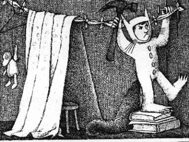 | ||||
| Maurice Sendak |

I'm having so many problems with this technology, I am wasting so much time with my beginner's mistakes! Here I was trying to show my finished image, plus the fact that although I can now control the size of the image in print, on paper - when it comes to what goes on the screen, how to place it, and make it in the same proportions as the original, it's the system controlling me rather than the other way at the moment. So this image should be 16.5 x 11.5 cm. I have show two here. The first one is scanned and added here. The second has been resized with photoshop elements first, and I have asked the computer to show it at that size, but look what I get (added as 'original size'). I have left it as an example of my continuing learning and battling.
Assignment 2: Point of Sale Display
The Brief:
To
create images which will be used within a campaign for a supermarket,
to package and promote a range of seasonal
foods.
The supermarket is respected
for the quality of food they supply. They want to promote this notion
of quality in their design and packaging.
The
finished images will be a 'point of sale' display sited in a store near
to the fruit and vegetables. The final reproduction size will be 12 x
12 inches (30.5 cm). Your artwork can be same size or in scale.
What to do:
Create an illustration of fruit or vegetables. One illustration for each of the ranges: Summer Autumn. I had no problem thinking of summer fruits:
Tomatoes
 | ||
| Gouache and watercolours |
Strawberries
 | |||||
| Gouache and watercolours |
Grapes
 | |||||||||
| Pen, watercolours and gouache |
I found the grapes more difficult to paint, and the strawberries the least - despite the fact that my son accidentally knocked the display of strawberries I was painting. Is it because I find them more tasty?
Then I was thinking about autumn fruits, are these apples and pears? berries? I saw some ripe blackberries in June, seasons are shifting..., my greengrocer didn't know (!), he said we can get fruits all the time...
It was at that time that I was really going back to working on my course like I should, and I wanted to enjoy it rather than being bothered by shifting seasons...
so I decided to follow my ideas, after all my illustrations were going to 'be me' and if they were not exactly what the brief asked for, I would see to that later...
So I took thought about it.
Here is what I decided to to:I took pictures of children with fruits (in the end I gave them the camera and they took the pictures themselves).
Then I chose the ones I wanted,and used them to paint portraits with fruits.
 | |
| Andy with tomato eyes |
Following this, I made a mood board for summer and used this to paint colours for a background.
 |
| Autumn mood board |
 |
| Summer mood board |
Finally I used the background to put together and finish my whole image digitally. This was exhausting as my skills with the computer are at the beginners stage (which shows when one looks at the unwanted line at the top which could have been avoided) but I'm determined to move on and keep learning.
 | ||
| Summer (Andy with tomato eyes) |
Here is my Autumn image for this assignment:

And finally, I am finally getting to grips with the presentation of my blog. It may not be perfect, but I am happier with it, and having less and less problems with it.

To make this image, I painted a portrait from two pictures: one had Leo
with a smiley face, and a pumpkin on his head, but it was not so clear
that it was a pumpkin. One the other picture, the face wasn't right, but
the pumpkin looked perfect. So I used paint.net and mixed the two
pictures. I chose to paint it like the other pictures in the same
series.
I realised that I had picked an image that did not go very well with the
square format needed and decided to crop this image to see if I could
get nearer to my ideal image. Here is the finished image:
 |
| Leo with pumpkin |
It
took me very long to assemble the scanned background, and the painting
on the computer. I have learnt these skills very recently and mostly
because of the finished product I wanted.
I was very pleased with the finished image,
except that it is obvious that I need to improve my 'photoshoping'
technique. I have heard of the term 'feathering' and if I have time,
will investigate to see if it is what I need here to improve on the
merging of the two pictures.
On reflection, I am pleased with the progress I have made in this area.
Other things I have to think about if I did something else like this:
. think of the format first - the pose (or position) of the subject and how it is going to fit that frame.
. think of my skills and the time available.
Learning something new takes a long time, maybe well spent but in the
long run I must be able to finish within deadlines (either for a
'client' or for my course).
I have one un-finished painting.
. always have the final image in mind.
Many of my initial pictures were not suitable - children making
terrible faces. Something else cropped up: I had given children a
selection of fruits, that they picked themselves.Perhaps I should have
been more in control of this too, like a film director!
And finally, I am finally getting to grips with the presentation of my blog. It may not be perfect, but I am happier with it, and having less and less problems with it.
Here are other illustrations for this project:
 |
| the photo |
 | ||
| my painting (oil) |
 |
| Summer - Josie with cherries |
I like my finished image. I also think that there are some digital software techniques that I probably don't know and could improve the image. Despite this, I imagine that if the brief came from a client, this may not be what they are looking for exactly. The fact that the images use oil paintings may be associated with quality.
The Brief: to design an illustration for a poster for a music event - I picked "a Jazz evening".
1. The moodboard: as usual, I found it very difficult to make one. I
spent some time on the computer looking at some of my favourite posters -
for a jazz festival in New Orleans, and others. I printed small images
of those I liked best. In the end I decided what they had in common was
mostly bright colours.
Ney Orleans Jazz & Heritage festival
Ivy Hayes
Milton (album cover)
Another influence:
 |
| Nótt, the personification of night in Norse mythology, rides her horse in this 19th century painting by Peter Nicolai Arbo. |
This led to sketches of jazz players and ideas about making a poster with cherubs (I posted these in an earlier post by mistake).
I have learnt that I am not good enough to use the computer to cut and paste images. Putting it all together was done with tracing paper. I liked moving the figures around on bits of tracing paper until I was happy with the scene. The function of my printer that can reduce or enlarge like a photocopier was also useful.
However to decide on the final images, I had scanned my drawing and turned it in slightly different visuals.
 |
 |
| Jazz 1 |
 |
| jazz 2 |
At this stage, I prefer "Jazz 1" as an image, but I'm not sure where the text will go. Having no experience of making posters, I looked at the kind of thing people write on theirs:
Jazz Funk
FRIDAY 9th APRIL
8 TIL LATE
THE SANDPIT CLUB, OHIE...
TEL 669 741859
JAZZ
At the
Spotted Dog
Every
Tuesday
8:30 pm
Alcester St Digbeth B120NH
Drinks discounts for students
and musicians.
Hot food Available for £1:50 etc.
Here is my poster. I have used the computer to add text as I think it may be done, this is only to give an idea of what it could be like.

The original painting has been made with acrylics, which I am just starting with. I still experience technical problems just to apply the paint smoothly! I also added pencil and graphite. Unfortunately, the graphite doesn't scan well and some of the shading does not show.
It is worth noting that for the first time, I am proud of the result, despite all its little problems!
|Assignment 4: Magazine Illustration
I chose an illustration of the topic of "lost". I wanted to work on the idea of a lost teddy. Armed with a teddy keyring, who looked not particularly happy, I placed it in various places in the house where it could look lost and sketched it.
 |
| Examples of sketches |


Unfortunately, light pencil drawing doesn't show very well here, so I have made a small selection from many sketches.
 | |||||||
I worked on the idea of making an image of a bear lost on a mountain of bricks, with emergency rescue mice trying to help.


 |
| I remembered the images of Richard Scarry and thought my mice should do things and get into funny situations to make it more interesting for children. |


 | ||||
Although this was 'finished' because of the assignment is overdue, I could have worked on it more. I wanted to add mice shadows, work on the shades of some cubes more to improve the perspective etc etc. I also thought making another image seen from a different point of view - as seen from the floor level, and experiment with ways of closing up on the mice to be able to have more details.
In conclusion, I really enjoyed this assignment and learnt a lot from it. I also re-discovered Richard Scarry, W. Heath Robinson, and Rube Goldberg. What a treat!
|Assignment 5: Seven Days
First ideas were based on the days of the weeks in songs on you tube,
but didn't find them very inspiring. Another idea was to make small
illustrations for a magazine, about the days of the week on the 5:2
diet. I started sketching ideas with a pig character.
 Reflecting on this, I thought I preferred making illustrations for children.
The Brief: the title is Seven days.
I chose to design illustrations that would be used online or in a brochure to schools, as a teaching aid. The illustrations would be about the days of the week, and show nursery rhymes associated with the first sound of the day of the week. For instance the sound "m" of 'Monday' would be associated with 'Mary had a little lamb', or 'Mary, Mary, quite contrary'.
The illustrations could be used for printing in a book, after consulting with a sample of schools. I also thought of making it possible for the designs to be used for making cross stitch, but since I have started working on this assignment, I haven't had the possibility to consult friends who do cross stitch and check if this is at all possible.
Here are my roughs:
The images I worked on were square. After uploading my pictures I have
noticed that the quality has gone down and that they have been slightly
changed, this is due to my scanner. There is also a large white margin
around each picture.

This is an example of the design for Monday, 'Mary, Mary, quite contrary', painted in colours (gouache).
I was inspired by the children books of Antoon Krings with their bright colorful illustrations and painterly style.
Sketchbook:


The Brief: the title is Seven days.
I chose to design illustrations that would be used online or in a brochure to schools, as a teaching aid. The illustrations would be about the days of the week, and show nursery rhymes associated with the first sound of the day of the week. For instance the sound "m" of 'Monday' would be associated with 'Mary had a little lamb', or 'Mary, Mary, quite contrary'.
The illustrations could be used for printing in a book, after consulting with a sample of schools. I also thought of making it possible for the designs to be used for making cross stitch, but since I have started working on this assignment, I haven't had the possibility to consult friends who do cross stitch and check if this is at all possible.
Here are my roughs:
 |
| Sunday |
 |
| Saturday |
 |
| Tuesday |
 |
| Wednesday |
 |
| Thursday. The raindrops added in pencil, haven't scanned! |
 |
| Friday |
 |
| Monday |

This is an example of the design for Monday, 'Mary, Mary, quite contrary', painted in colours (gouache).
I was inspired by the children books of Antoon Krings with their bright colorful illustrations and painterly style.
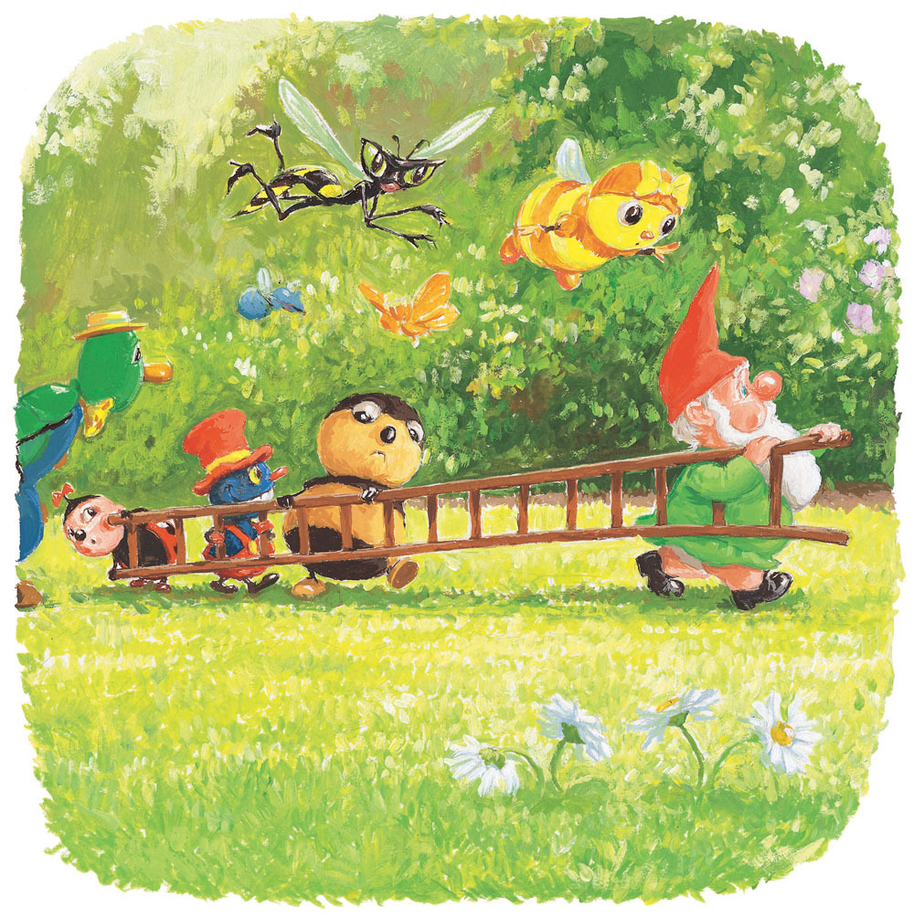 |
| Antoon Krings |

Subscribe to:
Posts (Atom)